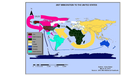
This weeks topic was Flow Mapping.
Process Summary:
- Navigate to s:drive. Create a folder for the week; Week 10_Flow Mapping.
- Navigate to r:drive and download this weeks shapefiles, 2 excel documents and the pdf file.
- Paste to Week 10_Flow Mapping and unzip world.zip and states.zip.
- Open ArcCatalog and Minimize. Navigate to the Week 10 folder. Bring up the files and view properties of the two shapefiles – No Projection.
- Open ArcMap Window and minimize. Drag the two shapefiles into ArcMap from ArcCatolog.
- Adjust the Map before converting to illustrator. Change to layout view. Change to landscape. Insert Neatline – Inside Margins with a Gap of 10, Border 2.0, Background – Blue, Drop Shadow – Grey 60%.
- Save: Week 10 Map_AK.mxd
- Add Scale Bar: Alternative 2 – miles. Title “2007 Immigration to the United States”. Author, date and Source (2007 INS Statistical Yearbook). Legend – allow for 8 different legends for each of the 8 regions to Map (USA, Africa, Asia, Europe, North America, South America, Oceania and Uknown/Australia) – additionally for legend border = 1.0 point, background = grey 40%, drop shadow = grey 60%, Gap = 10, Remove the term “Legend” prior to finishing inserting the legend.
- Save and then Export File as Week 10 Map_AK.ai under the week 10 folder. Exit out of ArcMap and open iIlustrator from the start menu. When you receive error message be sure to choose “update”.
- Insert 4 new layers and title: Map Title, North Arrow, Legend and Author. Move the respective items to each from the “Other 3” layer. Rename the Other 3 layer to Scale once have moved all other items out of it. Add a final layer titled “Flow Lines”. Lock all the layers that you are done with and do not want to alter.
- In Excel, calculate the width of your line using the formula; width of line symbol = (maximum line width = 10 here) X (Value/Maximum Value). Then insert corresponding stroke points to be able to reflect the line widths appropriately on the map Multiply the calculated Flow line width by “3” points.
- Using the pencil tool draw the lines. Add arrows to the end pointing at the United states using the Arroheads option from the stroke menu – Scale 30%. Match arrow color to that of the region. Add the text to the arrow = population migrating into the united states from the shown region. Example Details on Arrowheads:
- Asia – Sroke point 30 – right arrowhead, scale 30, color to match.
- Europe – Sroke point 17 – right arrowhead, scale 20, color to match.
- Once done drawing the arrow heads, insert the populations and align on the flow line.
- Lock all layers. Save and Export file as a Jpeg.

No comments:
Post a Comment